Federal spending to fight wildfires is trending higher. Not only is the overall, inflation-adjusted cost increasing, but the federal cost per wildfire and per acre burned are also on the upswing.
Before the federal shutdown turned government websites into virtual ghost towns, I was snooping around the National Interagency Fire Center’s site, and I came across some new data on suppression spending (specifically this table). Below is a screenshot of a dashboard that I built to visualize the data (click to enlarge).
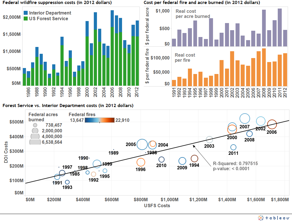 Some thoughts about the three graphics in this dashboard:
1) Overall costs increasing, but not steadily
In recent years, the annual tab for U.S. taxpayers has sometimes exceeded $2 billion (in 2012 dollars). But as we’ve discussed in previous posts, wildfire activity can vary dramatically from year to year, largely due to weather conditions, so the costs also jump around. The U.S. Forest Service accounts for the bulk of spending. As shown in the graphic below from our politics deck, wildfires make up the biggest chunk of the agency’s budget. Bad fire years often require emergency or supplemental spending, shown at the top in pink.

2) Why are costs per fire and acre increasing?
The acreage burned by wildfires is trending higher, so it’s not surprising that the overall total for suppression is also rising. But I was intrigued to discover that the amount of money spent per fire and per acre burned is also increasing. To calculate these measures, I took the total spending and divided by the number of fires and acres classified as “federal.” Now, I’m sure that some federal suppression funds have helped fight wildfires on non-federal lands, and I’m certain that the budgets of state and local fire agencies have sometimes helped battle fires on federal property. So this simple calculation may have issues, but it seems like a metric worth watching.
It’s not clear why these figures are rising. Is it a sign of mounting government inefficiency? Are increasingly intense wildfires more difficult to control? Are fire managers using more expensive resources, such as air power? For more on the last question, see this Los Angeles Times story, part of a great 2008 series on wildfires by Bettina Boxall and Julie Cart, who won the Pulitzer Prize for their work. Aviation accounts for about one-fifth of the Forest Service’s suppression budget, according to the story, but as the headline says, “Air tanker drops in wildfires are often just for show.”
3) Forest Service and Interior suppression costs move together
The scatterplot in the dashboard shows that wildfire spending by the Forest Service tends to track spending by agencies in the Interior Department, such as the National Park Service, Bureau of Land Management, and U.S. Fish and Wildlife Service. Not a big surprise, but these various agencies do manage different landscapes, with the Forest Service lands often found in higher elevation areas than rangeland overseen by the BLM, so you would expect some variability between them. The severity of the wildfire season isn’t the only determinant of suppression budgets. The overall fiscal climate presumably influences the budgets for these agencies in a similar way.
Data sources
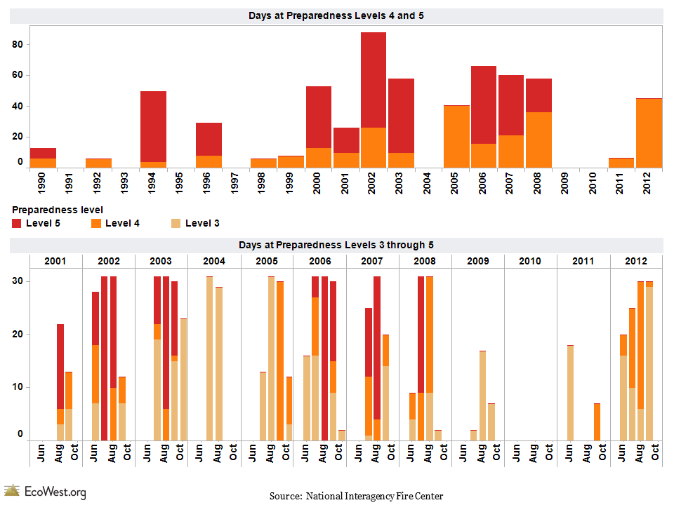
The National Interagency Fire Center is the data source for the suppression dashboard. The table also lists the total number of wildfires and acres burned, not just incidents on federal lands. Data on wildfires burned by landowner and agency are available for download our main wildfire page. We also track suppression metrics, such as days at various preparedness levels and deployment of firefighting assets, on this dashboard, which is described in this post.
Downloads
- Download Slides: Wildfire Suppression Costs (3187 downloads )
- Download Notes: Wildfire Suppression Costs (4002 downloads )
- Download Data: Wildfire Suppression Costs (3215 downloads )
EcoWest’s mission is to analyze, visualize, and share data on environmental trends in the North American West. Please subscribe to our RSS feed, opt-in for email updates, follow us on Twitter, or like us on Facebook.