
The Rim Fire burning in and around Yosemite National Park is generating national headlines due to its vast size and its threats to San Francisco’s water supply, the park’s majestic sequoias, and thousands of homes.
To put this fire in context, I’ve created a few of graphics that summarize recent fire seasons in California and the national picture thus far in 2013. You can download the PowerPoint deck and data at the bottom of this post.
Views of the fire
Before getting to the data, let me first share some compelling views of the Rim Fire. The nearly 190,000-acre blaze is big enough to be visible from the orbiting International Space Station. Here’s a photo that astronaut Karen Nyberg tweeted on Monday.
Our orbit took us directly over California’s Rim Fire about an hour ago. Devastating. August 26. pic.twitter.com/sCYXZPZTWq
— Karen L. Nyberg (@AstroKarenN) August 26, 2013
Here’s a time-lapse video, posted by park staff, that shows the Rim Fire’s growth.
You should also check out this stunning video of the fire, filmed from the perspective of a C-130J air tanker making drops of retardant (I recommend fast-forwarding to 4:00). The tanker is guided to its target by a smaller lead plane, and it’s interesting to hear the chatter among the pilots. Unfortunately, they haven’t figured out how to turn off the “landing gear” audible warning.
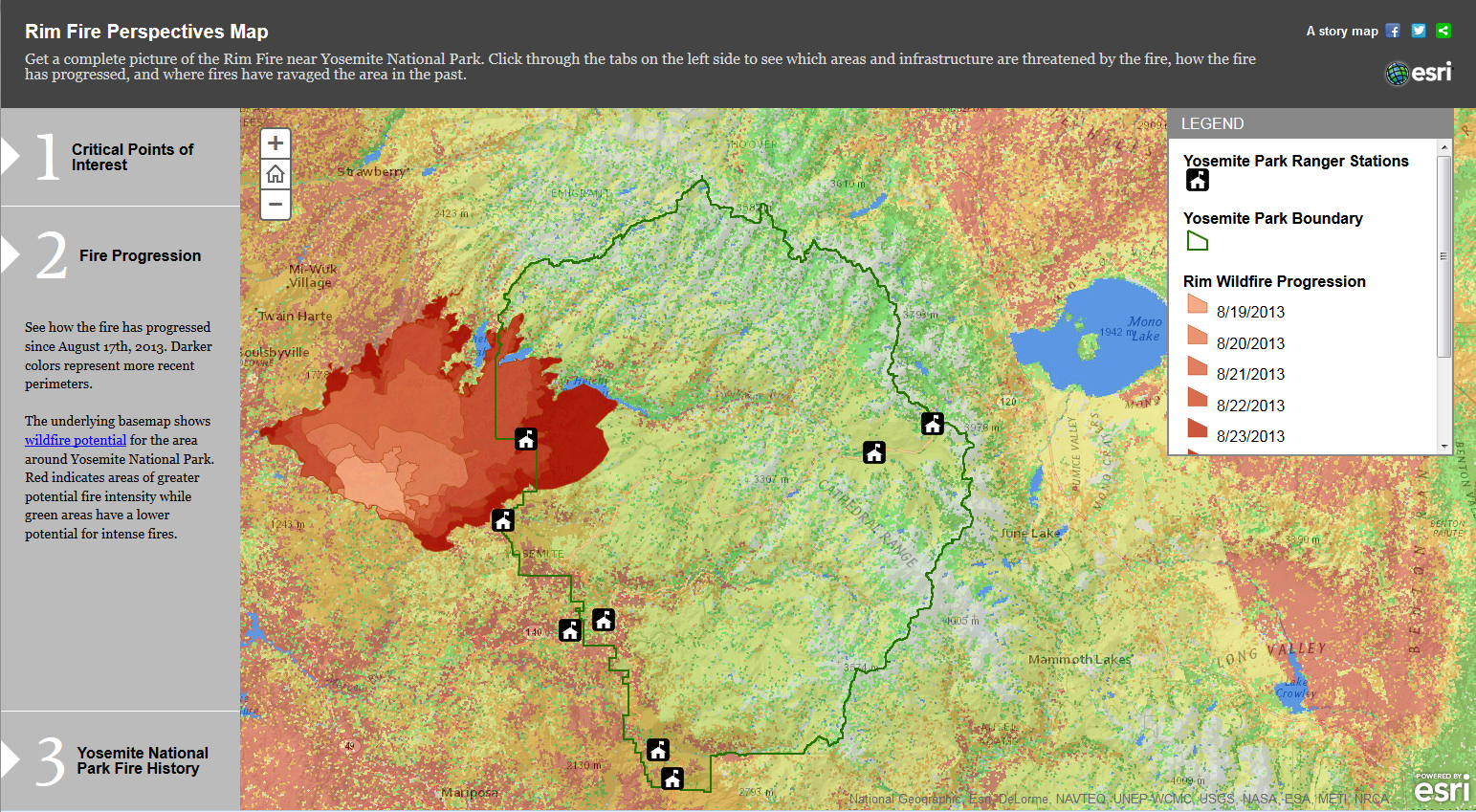
If you’re curious about the blaze’s footprint, ESRI has posted an interactive map of the Rim Fire, including its progression and perimeters of previous burns. Here’s a screen shot (click to enlarge).
EcoWest contributor David Kroodsma has put together an animated map of the fire’s progression.
Recent California fire history
The Rim Fire is currently the seventh-largest wildfire in California’s recorded history. Cal Fire says its data goes back to 1932, and the graphic below shows that seven of the 10 largest fires have burned in the past decade.

As Cal Fire notes, there were big wildfires prior to 1932, and we know from tree-ring records and other research that lightning and Native Americans would start fires that sometimes grew very large. The Rim Fire is less than a quarter contained, so it may well rise in the rankings.
Looking back over the past decade, there has been a downward trend in the number of wildfires in California, something that isn’t seen in the national-level data. The number of acres charred by fires has varied considerably from year to year, but the previous four years were relatively tame.

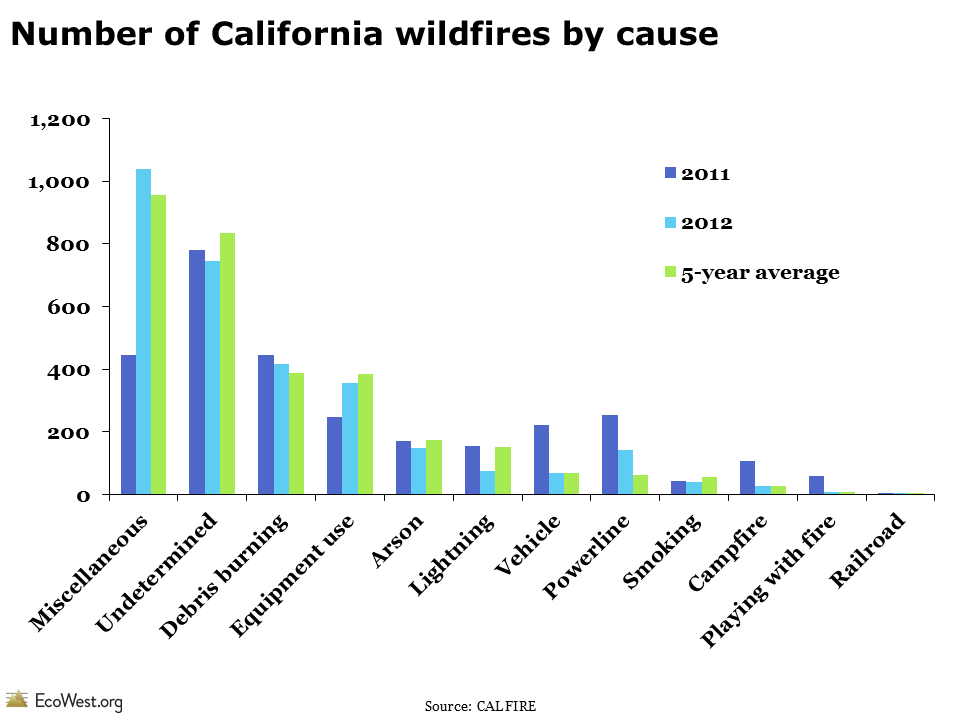
Cal Fire provides greater detail on the cause of wildfires than the National Interagency Fire Center (we present that data on this dashboard and this post). Below is a summary of wildfire ignitions in California. Lightning starts relatively few fires in the state and the cause of many blazes is never determined. The Rim Fire’s cause is under investigation.
National picture: below-average fire season
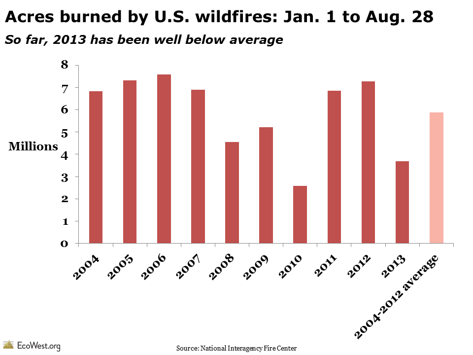
The Rim Fire and the deaths of 19 firefighters in Arizona in June will make 2013 a historic fire season, but in something of a paradox, 2013 is on track to be a below-average year for fire activity on the national level. The graphic below, based on data from the National Interagency Fire Center, shows the acreage burned each year from January 1 to August 28. So far, 2013 is the second lowest total since 2004. The 3,686,318 acres that have burned this year is just 63% of the 2004-2012 average.
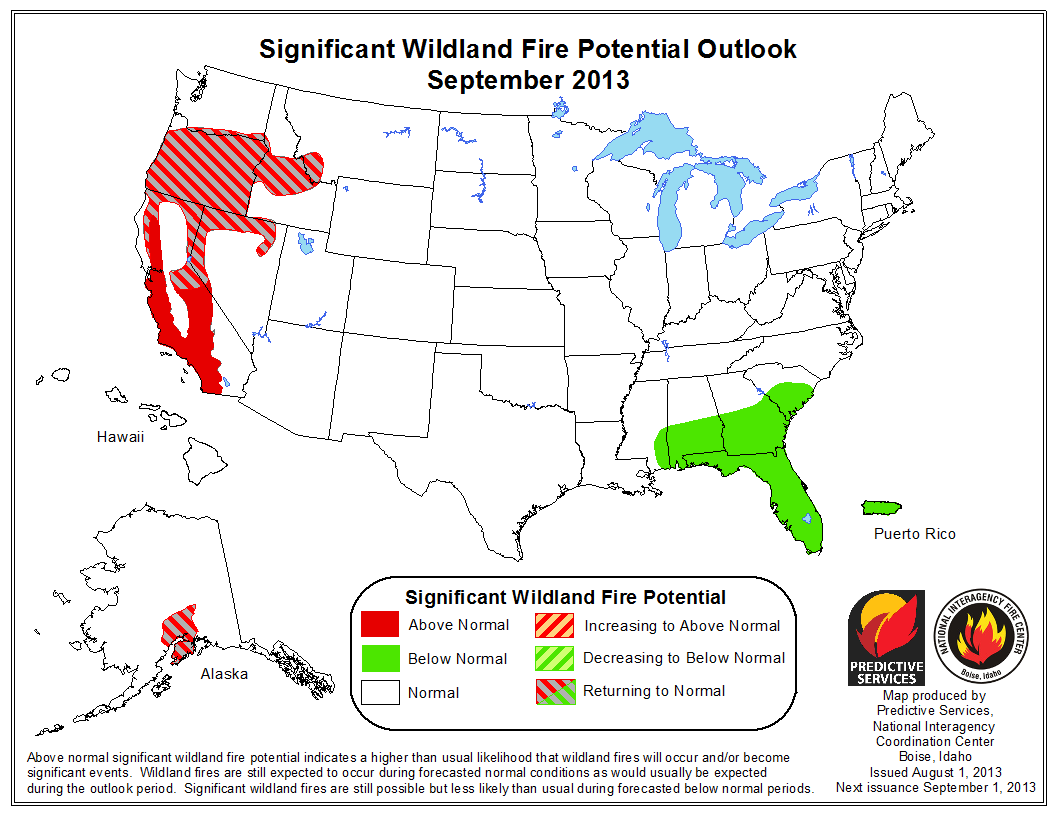
We’ve still got a way to go in the 2013 wildfire season, but many areas in the Southwest and Southern Rockies have received a good soaking over the past two months, so they are unlikely to add to the total in any big way. Going forward, the potential for large fires will be greatest in California, Nevada, Oregon, and Idaho.
 Overall trend: larger fires
One of my main takeaways from analyzing wildfire data is that the numbers can jump around from year to year, and we shouldn’t put too much stock in any single data point. Relatively small fires can kill people and destroy hundreds of homes, while enormous blazes in wilderness settings can do wonders for ecosystems. Overall, the trend in recent years has been toward larger fires and more acres burned, as shown below.

What’s not captured in these raw acreage totals is the real impact on the ground. What fraction of the landscape was nuked? How many acres are better off after a low-intensity burn? Reports from the fire lines and the imagery shared above suggest the Rim Fire is burning very intensely and could do considerable damage to the park’s resources and nearby residents’ homes.
Whatever the final acreage total, blazes like the Rim Fire are likely to become more common in the years and decades ahead, according to climate change projections. Andrew Freedman has a good discussion at Climate Central, which also provides this embeddable data visualization on Western wildfire trends.
Downloads
- Download Slides: Rim Fire in Context (2373 downloads )
- Download Data: Rim Fire in Context (2552 downloads )
Data sources
Data on California fires comes from Cal Fire and its 2012 red book. The agency also has PDFs showing the largest fires in terms of acres burned and structures lost.
The National Interagency Fire Center provides year-to-date totals for fires and acres burned on this page.
EcoWest’s mission is to analyze, visualize, and share data on environmental trends in the North American West. Please subscribe to our RSS feed, opt-in for email updates, follow us on Twitter, or like us on Facebook.
2 thoughts on “Viewing the Yosemite Rim Fire in context: images, maps, and graphics”
Comments are closed.